The modern mark of an individual
 by
Inchyra
by
Inchyra
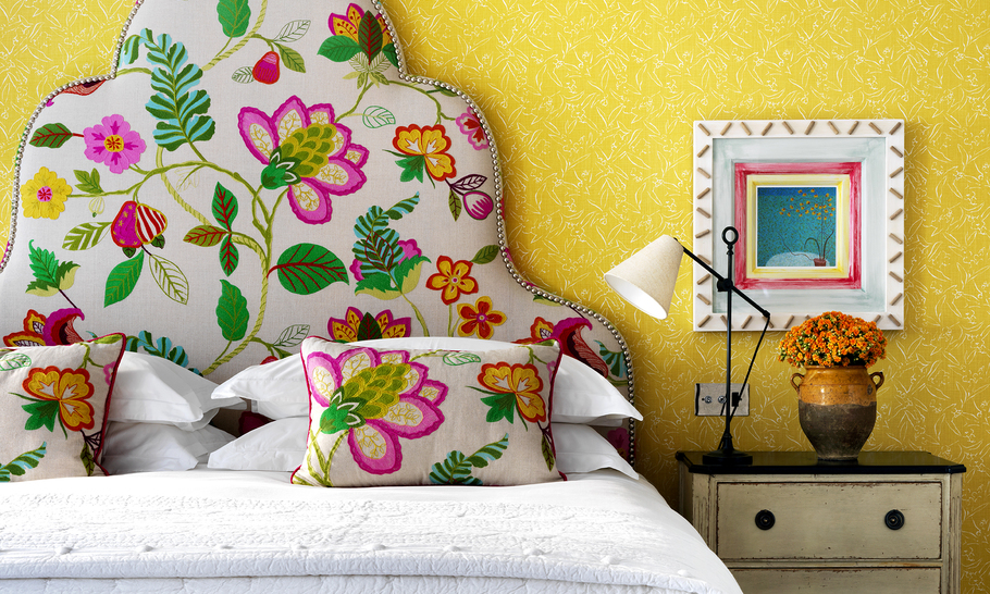
Knightsbridge Hotel; Picture credit: Simon Brown
Over the last few years there has been a marked difference in the approach to colour across interiors. Perhaps it’s a reaction to uncertain times but I suspect it is no coincidence that some of the biggest names in interiors in the current decade are designers who lavishly embrace colour in a way that has not been seen for some time. Treatments that include multiple bold colours can increasingly be seen. These designers are adding layers of vivid colour that bring life to an interior space in a way that a confined palette never could.
Perhaps the most interesting development in the use of colour is the way that it has started to flow again into public spaces in a meaningful way in trend-setting hotels and restaurants. We know that strong individuals have always expressed their personality through colour in the home – you only have to look at the Bloomsbury Group’s Charleston to see that – but since the early nineties, clients have often felt more comfortable following a very neutral colour palette. It provided a safe option for what can be both an expensive outlay and a window into the individual’s choices. In this judgemental world, it was much harder to go wrong that way. A shoe designer friend says that they would always make a few pairs of a new shoe design in a mad colour and people would fall in love with that shoe but buy the navy blue. It’s been largely the same with interiors. The current heroes of interior design are changing this, and it’s becoming easier for the individual to embrace their own colour choices.
And because a wider palette opens up so many more options, I see this approach running and running. It is at once clever, timeless, fun and brave – and perfectly timed to be embraced across social media. Increasingly, people are being empowered to make their own mark with colour – with the knock-on that briefs to designers become braver and choices expand. What a relief it must be for the designers to be let loose!
At the same time, the more expansive use of colour harks back to previous centuries where strong colours were the norm in important houses whose interiors have consistently stood the test of time. By embracing difference, an interior is infinitely harder to place in time and trend and thereby the interiors are given a longevity – important in times of economic uncertainty.
Interior designers that that only a short while ago might have been seen as bohemian and ‘out there’ now provide the zeitgeist. Just look at Martin Brudniski’s stunningly extravagant interiors at Annabel’s, Kit Kemp’s dynamic treatments for the Firmdale hotels or Ben Pentreath’s exciting use of colour as he creates interiors that contrive to be at once both modern and traditional.
And so, as these designers play with colour in a hugely influential way, early adopters are starting to emulate. While there will always be space for the character of a neutral palette, the cutting edge of interiors colour is bold and wild and shouting loudly. The doors have been opened again for the individual to make their mark through colour. At this level, whole interiors revolve around strong colour and, seeping down, it can be seen in the new breed of brightly hued sofas and chairs, and in the splashes of vivid colour on bold cushions and lampshades.
How wonderful for the palette to be unleashed! Long may it last.
The Inchyra Collection can now be seen at The Fabric Collective in Langton Street, Chelsea, at the Cupar, Scotland, showroom of At The Sign Of The Pelican and is exclusively represented in Australia by Nicola Lawrence Textiles & Wallpapers.